Reimagining an iconic motorsport brand, blending historic and future successes.
McLaren
Brand Concept
In the rarefied air of global competition, Bruce McLaren saw every day as opportunity to do more than just win–he did everything in the pursuit of absolute perfection.
Mirroring his predecessor’s drive to be the best, Ron Dennis’ introduction of the Honda engine took McLaren’s performance to previously unimagined heights. 1988 was a historic year of turbo fueled Formula 1 domination, a proud continuation of Bruce’s legacy and forward-thinking values.
It’s a balance that runs throughout McLaren’s history – heritage and innovation, performance and aesthetics, ambition and purpose. With those values in mind, I’ve envisioned an evolution of the McLaren brand that embodies that relentless focus on the future.
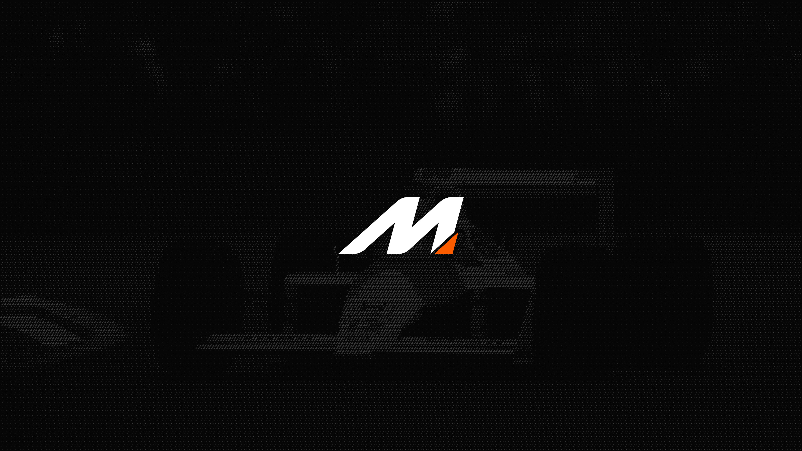
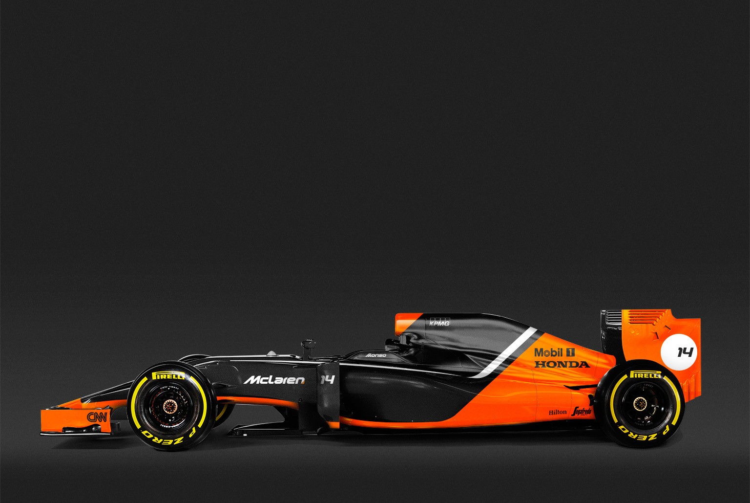
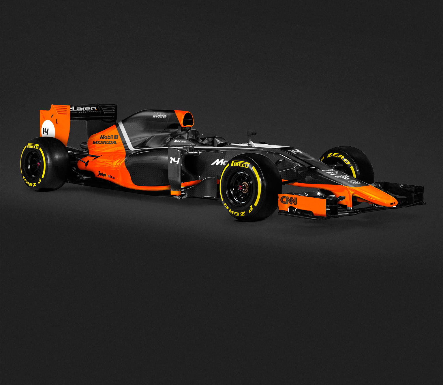
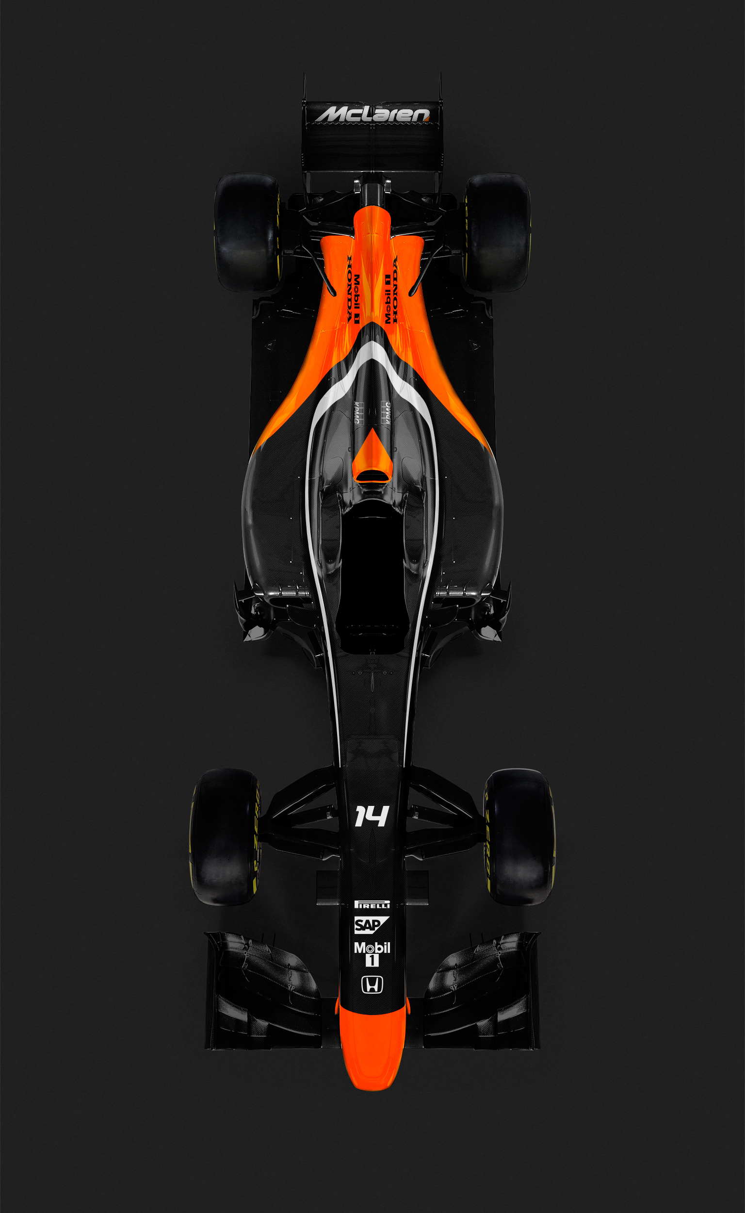
The bespoke typeface is italicized to create a sense of forward motion, drawing the eye to the “cutting edge” bottom-right corner. The cut creates an oblique angle that’s equal parts distinction and understatement. The corner itself is a combination of Bruce’s classic orange with the fluorescent red that represents the glory days of past, present, and future.
Since day one, every aesthetic detail of a McLaren has been dictated by engineering. This redesigned logo reinforces that singular precision while launching the brand into yet another era of excellence.
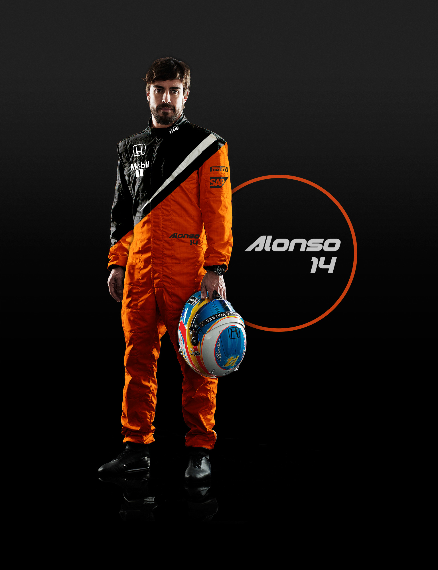
This evolved typeface, color palette, and visual identity will create a strikingly unique presence on the Formula1 circuit. The black coloring of the livery’s body is unpainted carbon fiber, a microscopic reduction of weight in true McLaren fashion.